May 23rd, 2026 – Douglas Hofstadter’s Five Principles of Ambigram Design
In Ambigrammia, Douglas Hofstadter articulates his five principles of ambigram design:
- Legibility/clarity: “To me, that’s the sine qua non of a good ambigram. If a design has zero readings rather than two, it should be called a nullogram rather than an ambigram.”
- Grace of line (the beauty of individual strokes and letter): “…a feeling of effortless and unforced grace of line.”
- Uniformity of style (across an entire ambigram): “…a global or large-scale property. This includes the desideratum (but certainly not a rigid rule) of not mixing cases (in other words, you should eschew lowercase letters in an uppercase ambigram, and vice versa).”
- Simplicity/minimality: “…a principle that is related to that of not caking on the makeup. Less is so often more.”
- Playfulness/humor: “…another aspect of certain ambigrams (though not of all good ones) that I rank very highly…”
May 15th, 2026 – My Journey
My graphic design journey to the world of ambigrams started from an ambigram of Paul McCartney. Before then, I was only vaguely aware of such things as ambigrams upon reading news about Dan Brown’s book featuring them. I was mesmerized by the album cover and immediately started sketching myself.
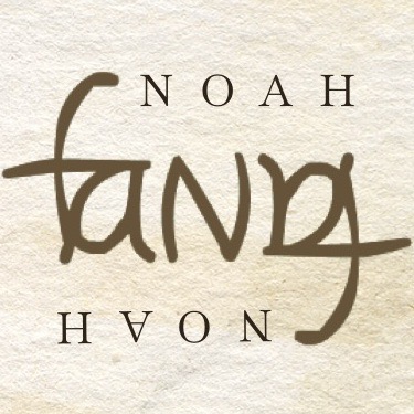
The first ambigram I sketched is my family name, “Fang”, which still holds up very well to this day. Realizing its difficulty, I stopped almost right after and for a very long time I didn’t really pay much attention to it.
More than a decade has passed until I picked it up again, prompted by a conversation with a colleague. Lots more experiments followed and I have since been practicing on and off, as much as my daily schedule allows.
I read John Langdon’s book Wordplay and much later Douglas Hofstadter’s Ambigrammia. I visit the ambigrams subreddit. I follow The Spin Doctor on Youtube. I’m having a lot of fun designing ambigrams for friends and colleagues.
Ambigrams are now a fun part of my life.
