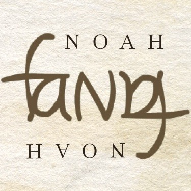
There was an early period of my ambigram journey when I implemented the completed designs on smart phone apps like Assembly (a vector design tool), mostly for convenience as I didn’t (and still don’t) want to spend too much time polishing things–it’s a “I’ve ten minutes to sapre” kind of hobby, after all.
That limitation forced a certain kind of approach to my exploring forms with the most basic lines and shapes. Most of my early ambigrams were designed with that in mind.
That’s one of the fascinating aspects of designing ambigrams: you have to start your exploration with certain kinds of formal foundation.
Some ambigrams’ formal foundation are certain calligraphic styles (e.g. Gothic, classical serif, handwritten scripts), while others are modern-leaning.
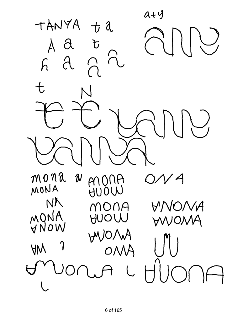
In my case–as shown in the sketch here–I tried to use basic straight lines and circular curves to get to a design for “Tanya.”
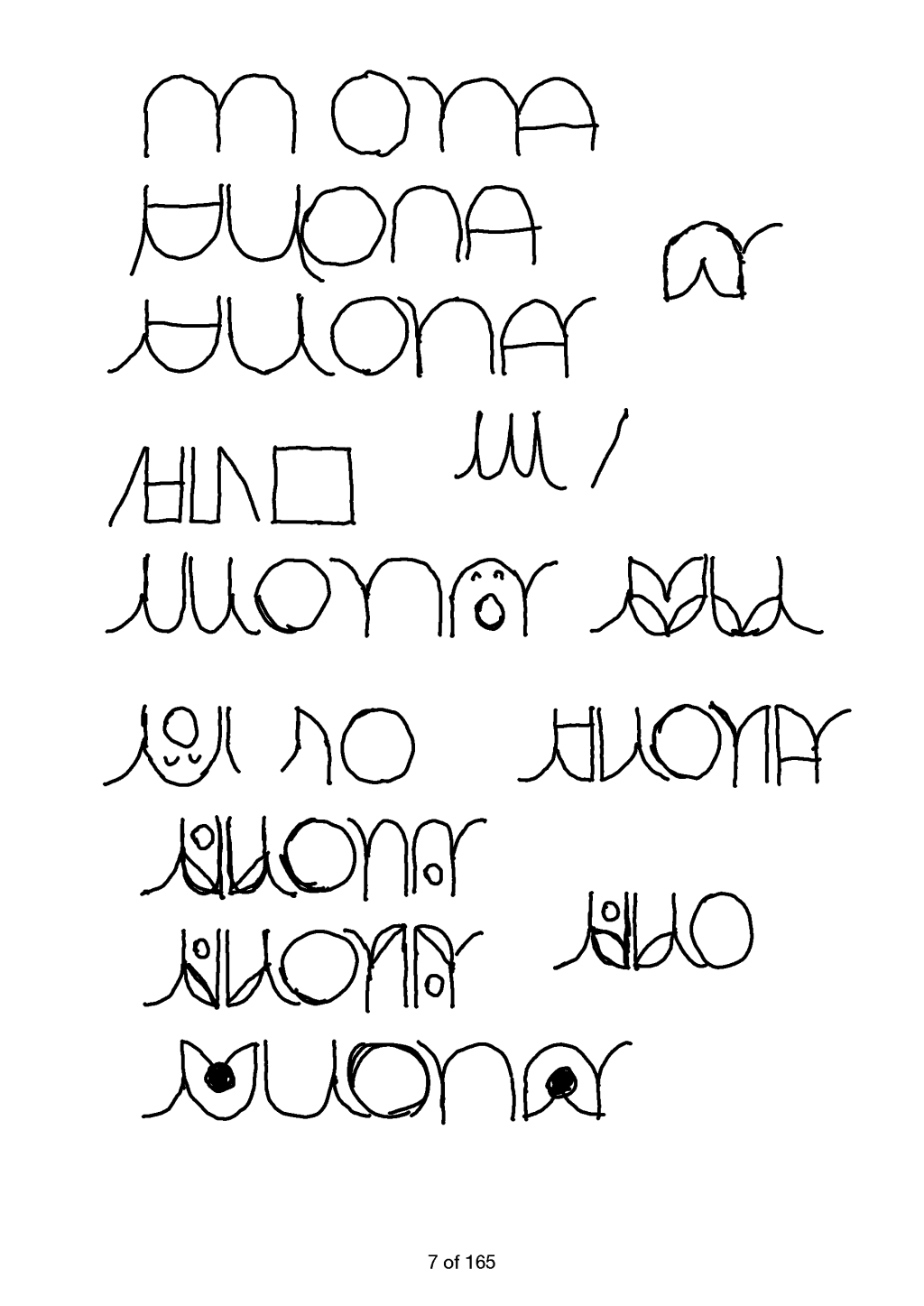
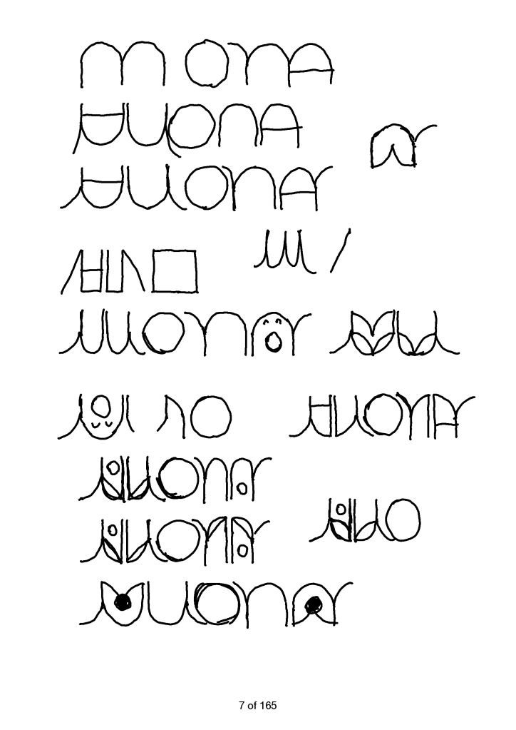
The rest of the sketches are for “Mona”. Again, I started with basic straight lines and curves to no avail. Eventually I added additional basic shapes such as dot to create a more playful and more legible design.
These are by no means good ambigrams, but good enough as a first draft.
That’s another fascinating experience: you only have a first draft when you know, with confidence, that you can improve it.

 Noah’s Ambigrams