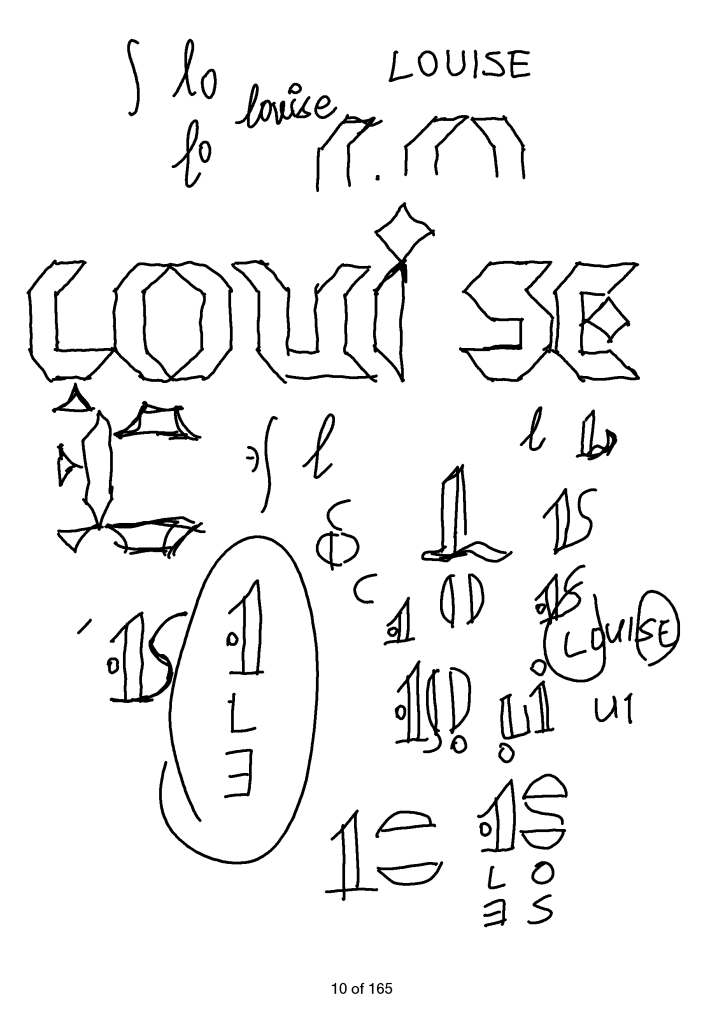
I was trying to use basic shapes to design “Louise”. Elementary shapes can be very powerful at times, but that time. I struggled to construct any viable idea using literally one elemental shape: right isosceles triangle, which can form a square.
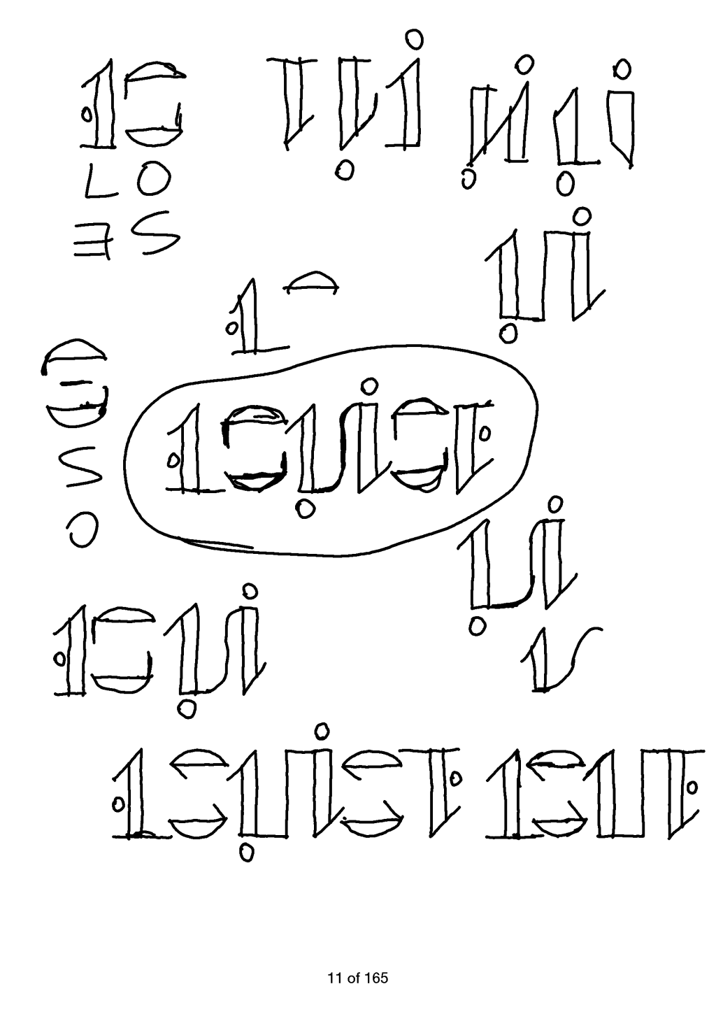
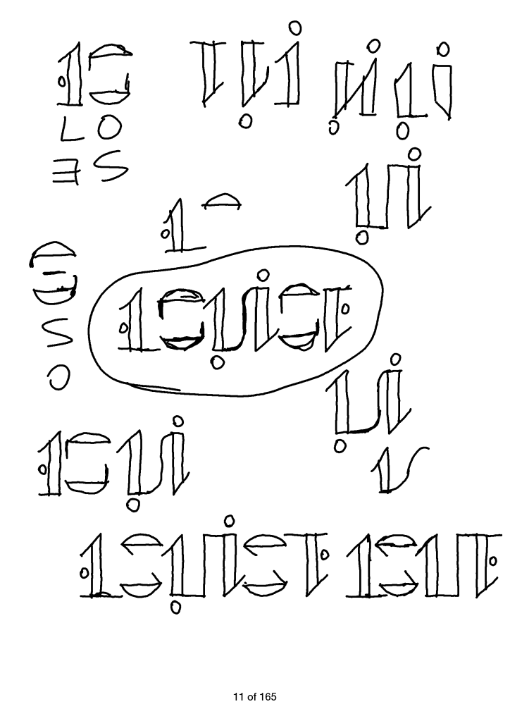
Then I switched to a thinner form, with thick vertical shapes and thin horizontal lines. That eventually led to the first version of the ambigram “LOUISE”, which is not very good: “L” doubles as “E”, “O” as “S”, “Ui” as itself. As bad as it is, I was very happy. I’d later revisit “Louise” and came up with a better design.
Such is the design of art (or art of the design?). You sketch and play around. You lose focus and get it again upon any seemingly promising idea. The first take of anything is bad. But in one way or another, that leads to a second take, and the next. As long as you keep sketching.


